5.5 Case Studies
The next section steps through case studies of our approach using simulations and an application to single cell RNA-seq data.
The first three case studies use simulations where the cluster structure and geometry of the underlying data is known. We start with a simple example where we generated spherical clusters that are embedded well by t-SNE. Then we move onto more complex examples where the tour provides insight, such as clusters that have substructure and where there is more complex geometry in the data.
In the final case study, we apply our approach to clustering the mouse retina data from Macosko et al. (2015), and apply the tour to the process of verifying marker genes that separate clusters.
We strongly recommend viewing the linked videos for each case study while reading. Links to the videos are available in table 5.1 and in the figures for each case study. The videos presented show the visual appearance of the liminal interface, and how we can interact with the tour via the controls previously described. If you are unable to view the videos, the figures in each case study consist of screenshots that summarise what is learned from combining the tour and an embedding view.
5.5.1 Case Study 1: Exploring spherical Gaussian clusters
To begin we look at simulated datasets that reproduce known facts about the t-SNE algorithm. Our first data set consists of five spherical 5-\(d\) Gaussian clusters embedded in 10-\(d\) space, each cluster has the same covariance matrix. We then computed a t-SNE layout with default settings using the Rtsne package (Krijthe 2015), and set up the liminal linked interface with grand tour on the 10-\(d\) observations.
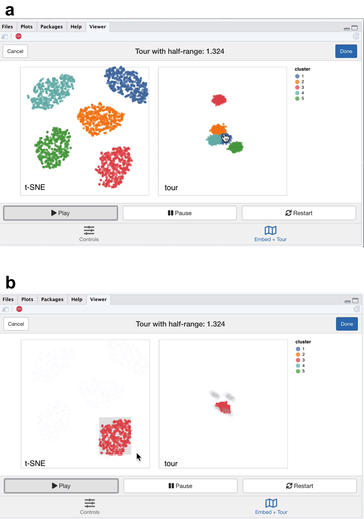
Figure 5.1: Screenshots of the liminal interface applied to well clustered data, a video of the tour animation is available at https://player.vimeo.com/video/439635921.
From the video linked in Figure 5.1, we learn that t-SNE has correctly split out each cluster and laid them out in a star like formation. This is agrees with the tour view, where once we start the animation, the five clusters begin to appear but generally points are more concentrated in the projection view compared to the t-SNE layout (Figure 5.1a). This can be seen via brushing the t-SNE view (Figure 5.1b).
5.5.2 Case Study 2: Exploring spherical Gaussian clusters with hierarchical structure
Next we view Gaussian clusters from the Multi Challenge Dataset, a benchmark simulation data set for clustering tasks (Rauber 2009). This dataset has two Gaussian clusters with equal covariance embedded in 10-\(d\), and a third cluster with hierarchical structure. This cluster has two 3-\(d\) clusters embedded in 10-\(d\), where the second cluster is subdivided into three smaller clusters, that are each equidistant from each other and have the same covariance structure. From the video linked in Figure 5.2, we see that t-SNE has correctly identified the sub-clusters. However, their relative locations to each other is distorted, with the orange and blue groups being far from each other in the tour view (Figure 5.2a). We see in this case that is difficult to see the sub-clusters in the tour view, however, once we zoom and highlight they become more apparent (Figure 5.2b). When we brush the sub-clusters in the t-SNE, their relative placement is again exaggerated, with the tour showing that they are indeed much closer than the impression the t-SNE view gives.
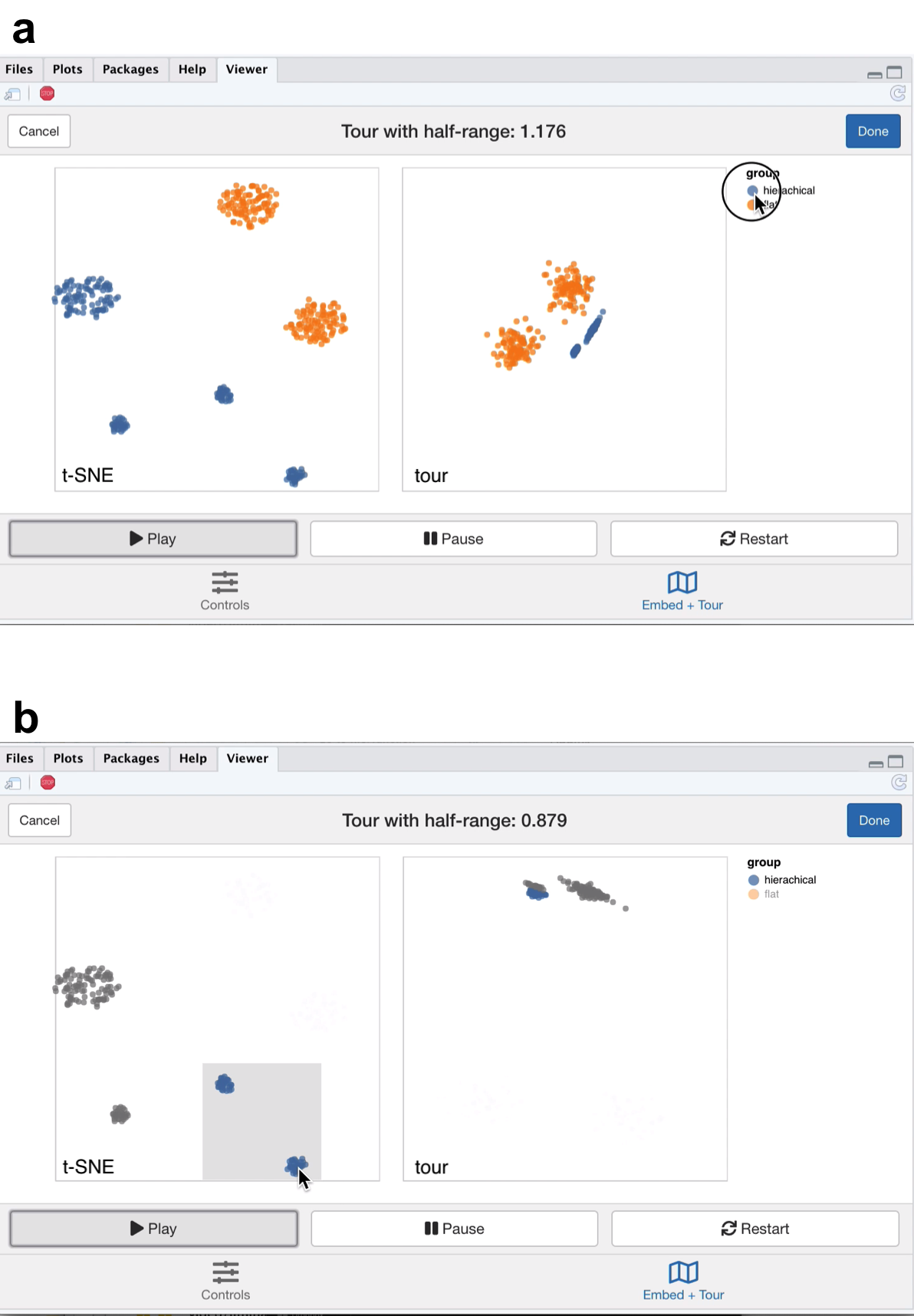
Figure 5.2: Screenshots of the liminal interface applied to sub-clustered data, a video of the tour animation is available at https://player.vimeo.com/video/439635905.
5.5.3 Case Study 3: Exploring data with piecewise linear structure
Next we explore some simulated noisy tree structured data (Figure 5.3). Our interest here is how t-SNE visualisations break topology of the data, and then seeing if we can resolve this by tweaking the default parameters with reference to the global view of the data set. This simulation aims to mimic branching trajectories of cell differentiation: if there were only mature cells, we would just see the tips of the branches which have a hierarchical pattern of clustering.
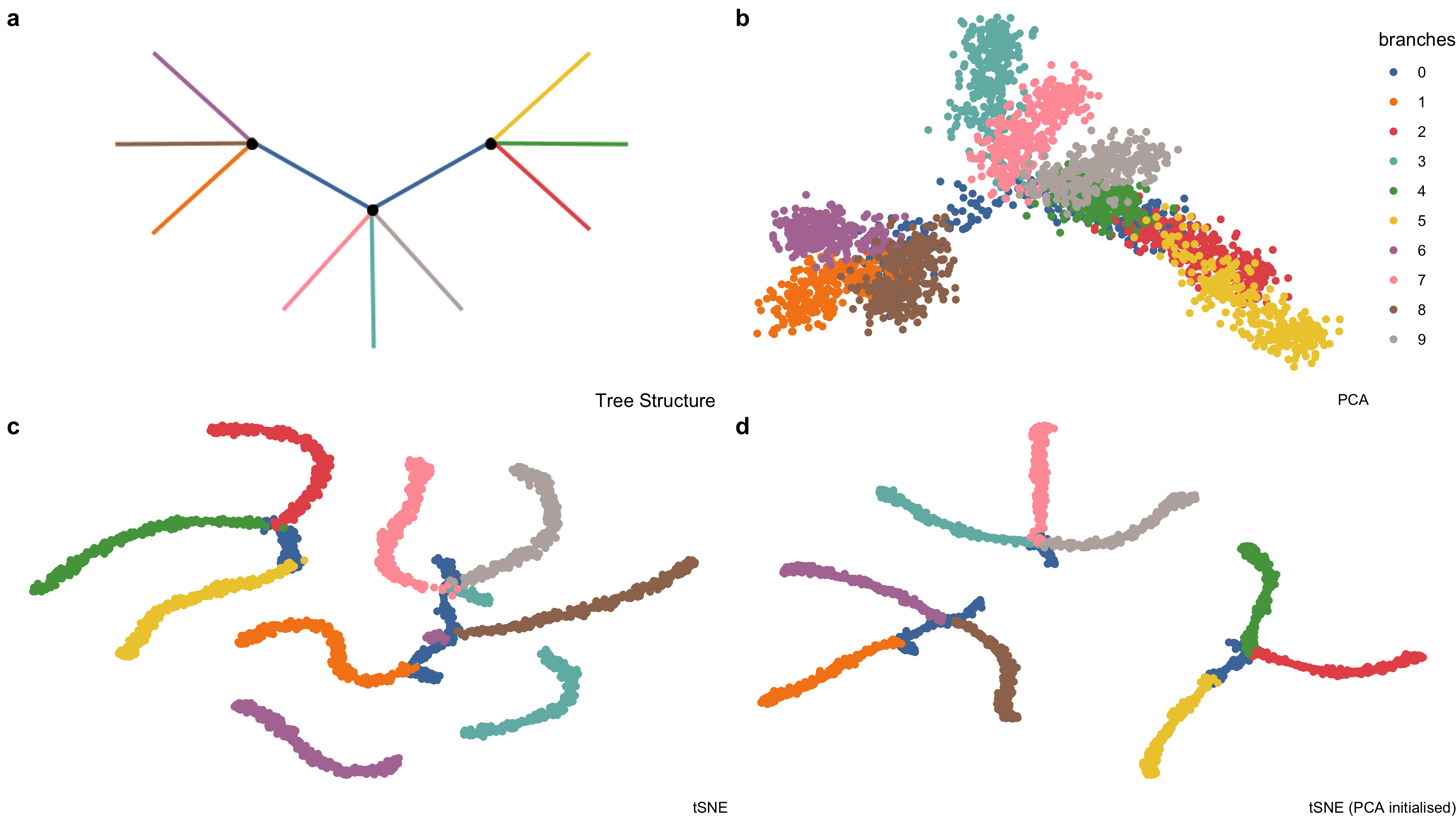
Figure 5.3: Example high-dimensional tree shaped data, \(n = 3000\) and \(p = 100\). (a) The true data lies on 2-\(d\) tree consisting of ten branches. This data is available in the phateR package and is simulated via diffusion-limited aggregation (a random walk along the branches of the tree) with Gaussian noise added (Moon et al. 2019). (b) The first two principal components, which form the initial projection for the tour, note that the backbone of the tree is obscured by this view. (c) The default t-SNE view breaks the global structure of the tree. (d) Altering t-SNE using the first two principal components as the starting coordinates for the embedding, results in clustering the tree at its branching points.
First, we apply principal components and restrict the results down to the first twelve principal components (which makes up approximately 70% of the variance explained in the data) to use with the grand tour.
Moreover, we run t-SNE using the default arguments on the complete data (this keeps the first 50 PCs, sets the perplexity to equal 30 and performs random initialisation). We then create a linked tour with t-SNE layout with liminal as shown in Figure 5.4.
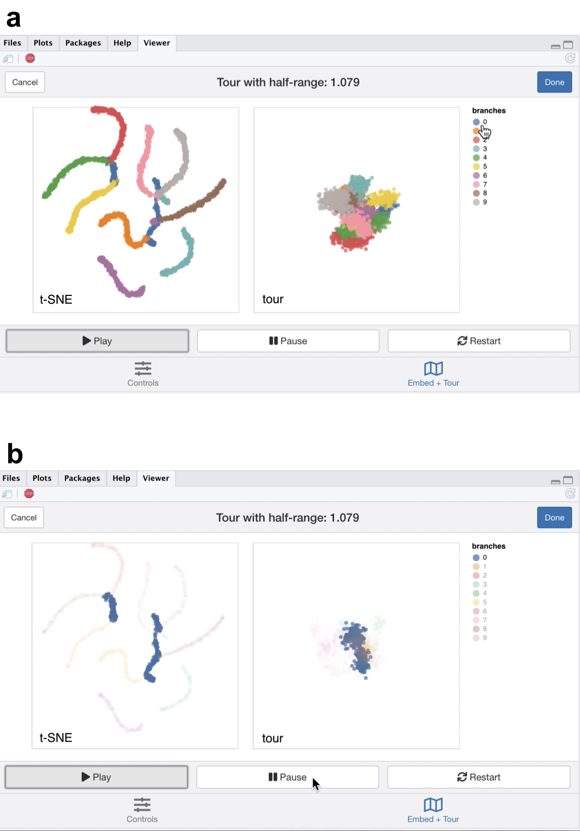
Figure 5.4: Screenshots of the liminal interface applied to tree structured data, a video of the tour animation is available at https://player.vimeo.com/video/439635892.
From the linked video, we see that the t-SNE view has been unable to recapitulate the topology of the tree - the backbone (blue) branch has been split into three fragments (Figure 5.4a). We can see this immediately via the linked highlighting over both plots. If we click on the legend for the zero branch, the blue coloured points on each view are highlighted and the remaining points are made transparent. From, here it becomes apparent from the tour view that the blue branch forms the backbone of the tree and is connected to all other branches. From the video it is easy to see that cluster sizes formed via t-SNE can be misleading; from the tour view there is a lot of noise along the branches, while this does not appear to be the case for the t-SNE result (Figure 5.4b).
From the first view, we modify the inputs to the t-SNE view, to try and produce a better trade-off between local structure and retain the topology of the data. We keep every parameter the same except that we initialise \(Y\) with the first two PCs (scaled to have standard deviation 1e-4) instead of the default random initialisation and increase the perplexity from 30 to 100. We then combine these results with our tour view as displayed in the linked video in the caption of Figure 5.5.
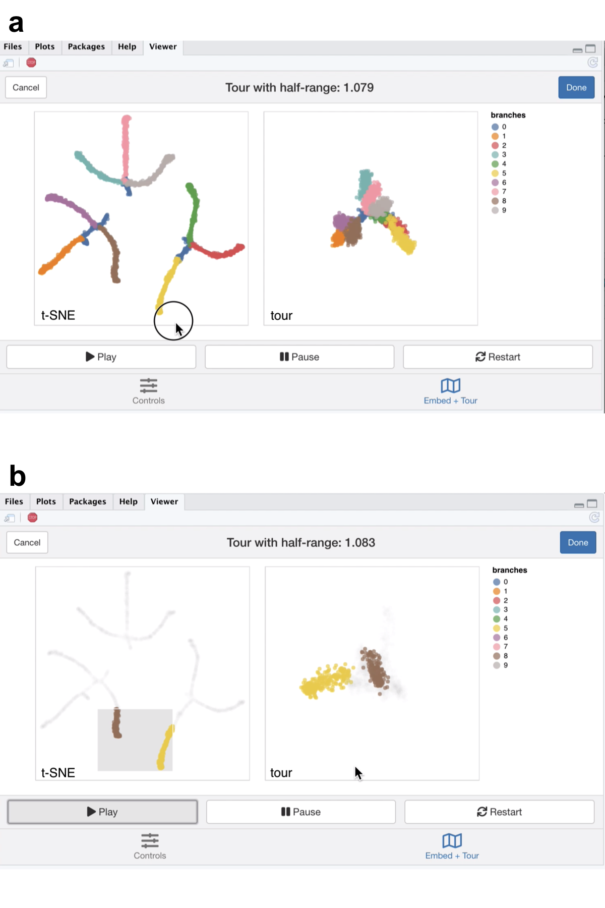
Figure 5.5: Screenshots of the liminal interface applied to tree structured data, a video of the tour animation is available at https://player.vimeo.com/video/439635863.
The video linked in Figure 5.5 shows that this selection of parameters results in the tips of the branches (the three black dots in Figure 5.3a) being split into three clusters representing the terminal branches of the tree. However, there are perceptual issues following the placement of the three groupings on the t-SNE view that become apparent via simple linked brushing. If we brush the tips of the yellow and brown branches (which appear to be close to each other on the t-SNE view), we immediately see the placement is distorted in the t-SNE view, and in the tour view these tips are at opposite ends of the tree (Figure 5.5b). Although, this is a known issue of the t-SNE algorithm, we can easily identify it via simple interactivity without knowing the inner workings of the method.
5.5.4 Case Study 4: Clustering single cell RNA-seq data
A common analysis task in single cell studies is performing clustering to identify groupings of cells with similar expression profiles. Analysts in this area generally use non linear DR methods for verification and identification of clusters and developmental trajectories (i.e., case study 1). For clustering workflows the primary task is verify the existence of clusters and then begin to identify the clusters as cell types using the expression of “known” marker genes. Here a ‘faithful’ a embedding should ideally preserve the topology of the data; cells that correspond to a cell type should lie in the same neighbourhood in high-dimensional space. In this case study we use our linked brushing approaches to look at neighbourhood preservation and look at marker genes through the lens of the tour. The data we have selected for this case study has features similar to those found in case studies 2 and 3.
First, we downloaded the raw mouse retinal single cell RNA-seq data from Macosko et al. (2015) using the scRNAseq Bioconductor package (Risso and Cole 2019). We have followed a standard workflow for pre-processing and normalizing this data (described by Amezquita et al. (2020)): we performed QC using the scater package by removing cells with high proportion of mitochondrial gene expression and low numbers of genes detected, we log-transformed and normalised the expression values and finally selected highly variable genes (HVGs) using scran (McCarthy et al. 2017; Lun, McCarthy, and Marioni 2016). The top ten percent of HVGs were used to subset the normalised expression matrix and compute PCA using the first 25 components. Using the PCs we built a shared nearest neighbours graph (with \(k = 10\)) and used Louvain clustering to generate clusters (Blondel et al. 2008).
To check and verify the clustering we construct a liminal view. We tour the first five PCs (approximately 20% of the variance in expression), alongside the t-SNE view which was computed from all 25 PCs. We have selected only the first five PCs because there is a large drop in the percentage of variance explained after the fifth component, with each component after contributing less than one percent of variance. Consequently, increasing the number of PCs to tour would increase the dimensionality and volume of the subspace we are touring but without adding any additional signal to the view.
Due to latency of the liminal interface we do a weighted sample of the rows based on cluster membership, leaving us with approximately 10 per cent of the original data size - 4,590 cells. Although this is not ideal, it still allows us to get a sense of the shape of the clusters as seen from the linked video in Figure 5.6. If one was interested in performing more in-depth cluster analysis we recommend an iterative approach of removing large clusters and then re-running the liminal view as a way finding more granular cluster structure.
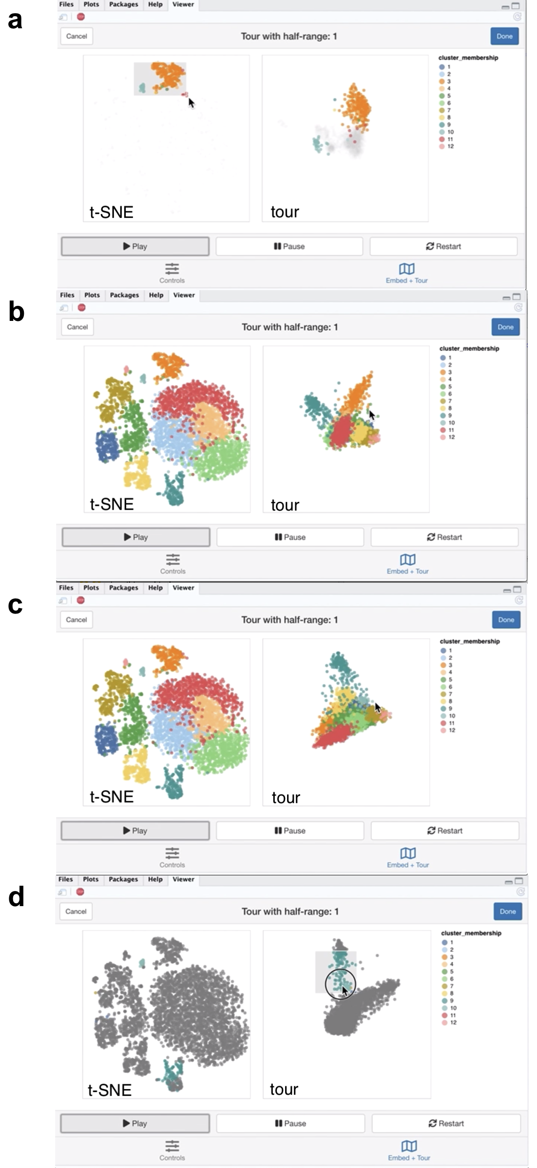
Figure 5.6: Screenshots of the liminal interface applied to single cell data, a video of the tour animation is available at https://player.vimeo.com/video/439635812.
From the video linked in Figure 5.6, we learn that the embedding has mostly captured the clusters relative location to each other to their location in high dimensional space, with a notable exception of points in cluster 3 and 10 as shown with linked brushing (Figure 5.6a). As expected, t-SNE mitigates the crowding problem that is an issue for tour in this case, where points in clusters 2,4,6, and 11 are clumped together in tour view, but are blown up in the embedding view (Figure 5.6b). The tour appears to form a tetrahedron like shape, with points lying on surface and along the vertices of the tetrahedron in 5-\(d\) PCA space - a phenomena that has also been observed in Korem et al. (2015) (Figure 5.6c). Brushing on the tour view, reveals points in cluster 9 that are diffuse in the embedding view, points in cluster 9 are relatively far away and spread apart from other clusters in the tour view, but has points placed in cluster 3 and 9 in the embedding (Figure 5.6d).
Next, we identify marker genes for clusters using one sided Welch t-tests with a minimum log fold change of one as recommended by Amezquita et al. (2020), which uses the testing framework from McCarthy and Smyth (2009). We select the top 10 marker genes that are upregulated in cluster 2, which was one of the clumped clusters when we toured on principal components. Here the tour becomes an alternative to a standard heatmap view for assessing shared markers; the basis generation (shown as the biplot on the left view) reflects the relative weighting of each gene. We run the tour directly on the log normalised expression values using the same subset as before.
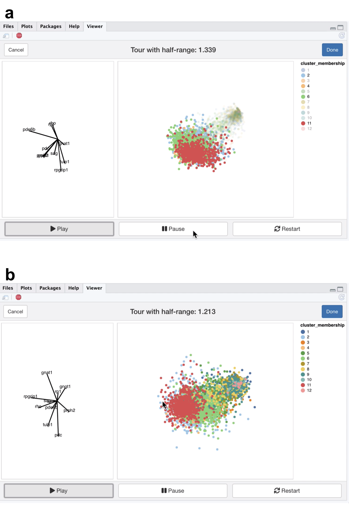
Figure 5.7: Screenshots of the liminal tour applied to a marker gene set, a video of the tour animation is available at https://player.vimeo.com/video/439635843.
From the video linked in Figure 5.7, we see that the expression of the marker genes, appear to separate the previously clumped clusters 2,4,6, and 11 from the other clusters, indicating that these genes are expressed in all four clusters (Figure 5.7a). After zooming, we can see a trajectory forming along the clusters, while the axis view shows that magnitude of expression in the marker genes is similar across these separated clusters which is consistent with the results of marker gene analysis (Figure 5.7b).