1.4 Interactive visualisation for high-dimensional data
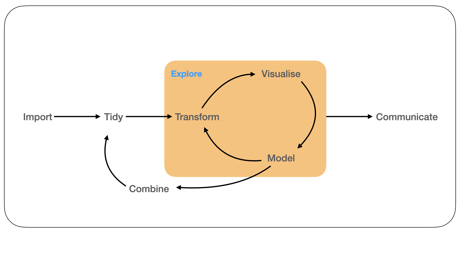
Figure 1.4: Visualisation is a tool for making sense of models. Here we explore, how well a model has captured the structure within the data using interactive graphics.
Finally, we move away from data wrangling and towards the integration of visualisation with model-based summaries of high-dimensional data sets (Figure 1.4). We focus on a common tool for EDA (especially applied to single-cell transcriptomics): non-linear dimension reduction (NLDR). We consider the incorporation of interactive and dynamic graphics to assist analysts in using NLDR techniques for cluster orientation tasks. In particular, we advocate for the use of tours (Cook et al. 1995) alongside an NLDR visualisation to highlight potential pitfalls and distortions obtained from an NLDR method. This approach acknowledges that there is no ‘one’ best visualisation or dimension reduction for a high-dimensional dataset, and we often want to have an understanding of both the global and local structure within our data.
Chapter 5 introduces a software package called liminal for constructing these views and a user interaction framework for identifying distortions. We present several case studies using data that capture aspects of single cell transcriptomics workflows, and use our approach to diagnose the quality of results obtained via popular NLDR methods like t-distributed stochastic neighbour embeddings (t-SNE) (Maaten and Hinton 2008).